
Gathern / Mobile experience
A clearer path
to booking.
Enhancing the main flow
Product Designer
Research · Experimentation · UX & UI
Visit-to-booking conversion
Touchpoints
Checkout pages
Performance figures are approximate and rounded to protect confidential business information.
How to read the numbers
Conversion means completed bookings divided by total visits. The approximate before/after result describes the combined journey improvements, not the homepage A/B test alone. Scope counts describe the design; additional metric definitions below explain the measurement approach without publishing exact analytics.
01 / Research
Find the friction. Clarify the next step.
I combined user research, behavioral data and analysis of the existing journey to understand what guests needed to find, compare and book a stay.
Search visibility
Promotional content competed with the search entry. People needed a clearer starting point and a direct route into available units.
Decision confidence
Useful information was available across the experience, but its hierarchy could do more to help guests compare options and choose.
Payment clarity
A separate review and payment step created an opportunity to simplify the structure and make the amount due easier to understand.
The aim was to help guests act with confidence. I reduced competing homepage messages, including repeated reassurance about safety and guarantees that research suggested could introduce doubt rather than resolve it.
From research to a journey structure
A retrospective map of the design logic, rather than an original research artifact.
- 01
Discover
Make search and inspiration easy to find.
- 02
Shortlist
Surface relevant filters and comparable cards.
- 03
Decide
Bring important evidence into view.
- 04
Book
Review the stay and choose how to pay.
02 / Home experience
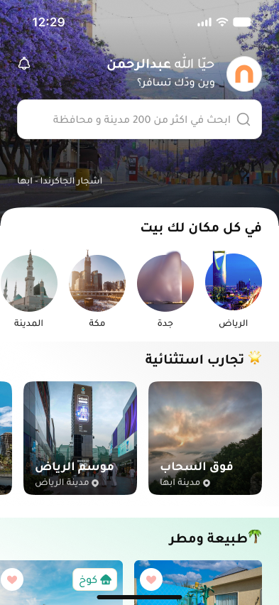
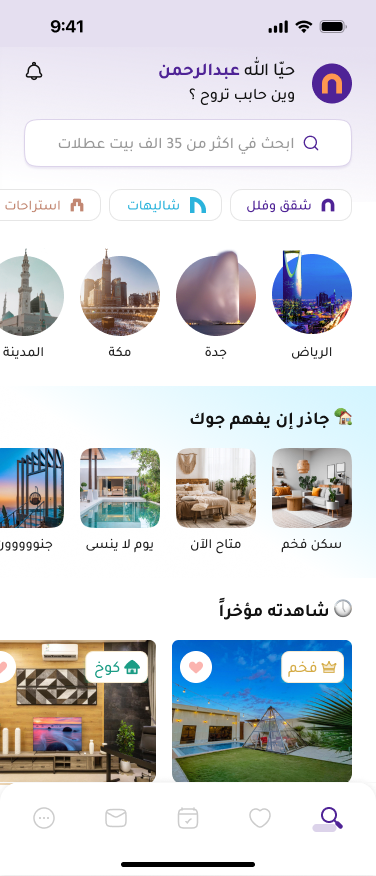
A homepage built to help people start.
A clearer search entry, useful destination cues and direct access to units gave guests more than one way to begin.

Make the next action obvious
Bring search into the opening view and simplify the surrounding content so the next step is easier to recognise.
Offer a direct path to units
Let guests open a stay from homepage content without requiring them to complete a search flow first.
2 variants / A/B test
Inspiration helped people move forward.
We tested a more visual direction against a quieter alternative. Variant A, with the large Abha image and city-landmark discovery, performed better on CTR and conversion and became the selected direction.
The result is reported qualitatively here; exact variant-level rates, sample sizes and test duration are not disclosed.
Measurement focusSearch starts, city-carousel CTR, direct unit opens and downstream bookings.
03 / Search results
Less effort to narrow the choice.
Research and usage analysis pointed to recurring preferences: price, location, neighbourhoods and directions, alongside amenities such as self check-in, pools and bedrooms.

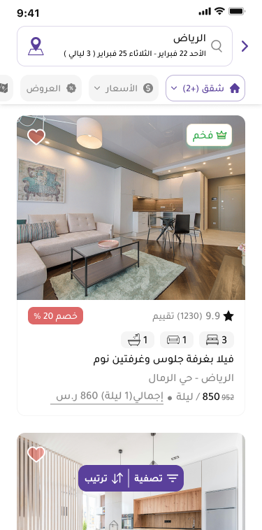
Quick filters for common needs
Put frequently used choices into chips above the results, so guests can refine the list without opening the full filter view every time.
Keep the complete filter route
Retain the full set for more specific requirements. Quick filters shorten frequent tasks while the wider filtering experience remains available.
Measurement focusQuick-filter adoption, listing CTR and progression from results into unit details.
04 / Unit details
Help guests make a confident choice.
I reorganised the unit page into clear sections and brought decision-making information closer to the top: visual evidence, relevant amenities, reviews and payment context.
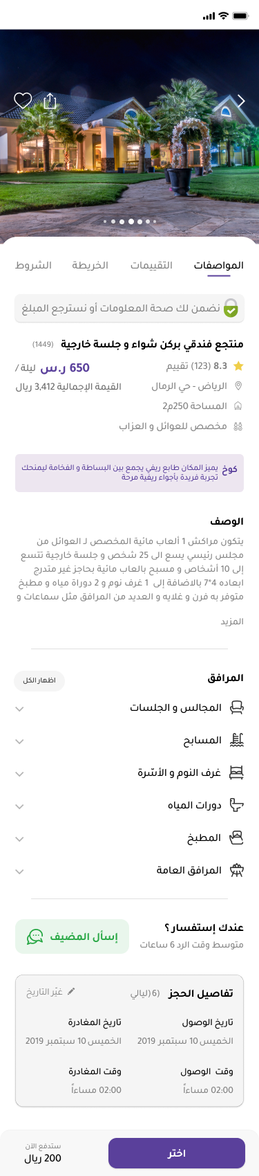
Show the stay, including video
Make the video entry easier to discover alongside the gallery, rather than leaving useful visual evidence difficult to reach.
Prioritise the useful details
Highlight commonly requested amenities and payment information, with guest reviews supporting the decision.

Give each kind of information a place.
Amenities, location, booking policies and host information now have distinct sections. Adding the host’s name and profile makes it clearer who is behind the stay.
Measurement focusCheckout starts, gallery/video engagement and use of reviews, amenities and host information.
05 / Checkout
Review. Choose. Confirm.
We reviewed where guests left the payment journey and brought booking review and payment into one structured page.
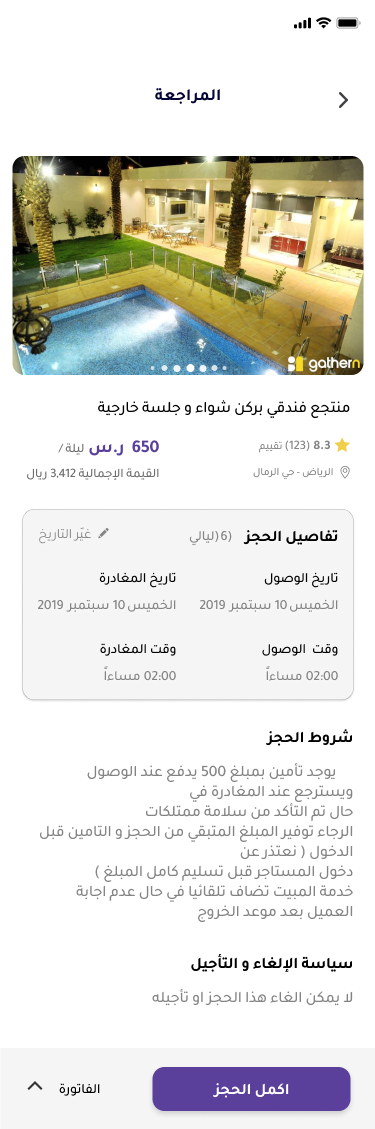
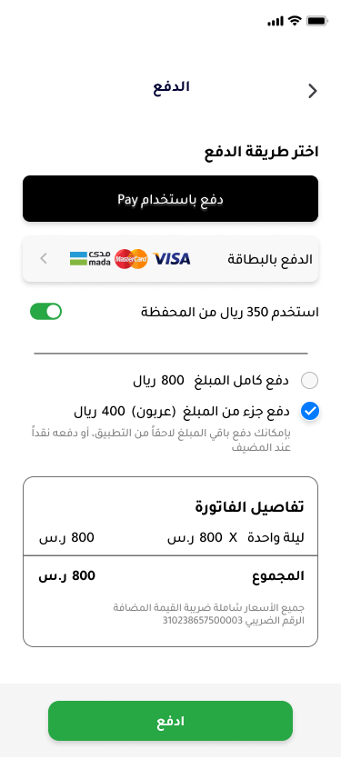
pages in checkout
One place to review the stay, understand what is due and select a payment method.

A clear order for the decision.
Review the booking
Check the unit, dates and booking conditions.
Understand the amount due
See the price breakdown and what will be paid now.
Choose how to pay
Keep payment options together, including Apple Pay, and make the confirmation action clear.
Measurement focusCheckout completion, payment-method selection and payment failures.
06 / Outcome & reflection
Improve the journey.
Measure the whole experience.
Across the main flow, the reported visit-to-booking conversion moved from approximately 5–6% to approximately 12%. The work connected easier discovery, clearer decisions and a more structured checkout.
Approximate absolute conversion increase
Approximate conversion ratio
Derived from the same rounded before/after values, not additional measured outcomes. These results are presented across the journey and do not isolate the impact of one design change.
Where is the guest losing momentum, and what evidence helps us decide what to improve next?
Explore the measurement framework
Definitions for interpreting the journey and evaluating individual changes. This is a measurement framework, not a table of undisclosed results. Keep exposure, session and impression definitions consistent when comparing versions.
| Metric | Definition | Question |
|---|---|---|
| Visit-to-booking conversion | Completed bookings ÷ total visits | The end-to-end outcome |
| Search entry rate | Visits with a search start ÷ total visits | Can people find their next action? |
| City carousel CTR | Visits selecting a city ÷ visits exposed to the carousel | Do destination cues encourage exploration? |
| Direct discovery CTR | Visits opening a unit from home ÷ visits exposed to home listings | Can people explore without starting a search? |
| Listing CTR | Unit-detail opens ÷ listing impressions | Do results help people shortlist? |
| Quick-filter adoption | Result sessions using quick filters ÷ sessions exposed to them | Are common preferences easy to apply? |
| Checkout-start rate | Sessions starting checkout ÷ eligible unit-detail sessions | Can guests make a confident decision? |
| Checkout completion | Completed bookings ÷ checkout starts | Can intent become a completed booking? |
| Payment failure rate | Failed payment attempts ÷ all payment attempts | Where does payment need attention? |